One of the most fascinating and strange aspects of print design is dealing with light. Strange because a poster can’t emit light on its own – at least not literally. Still, it has to glow and strike the eye, and my favorite posters certainly carry a light of their own. The suggestion of light has to be worked into a design so that the darkness glows darker and the light seems to emit from paper.
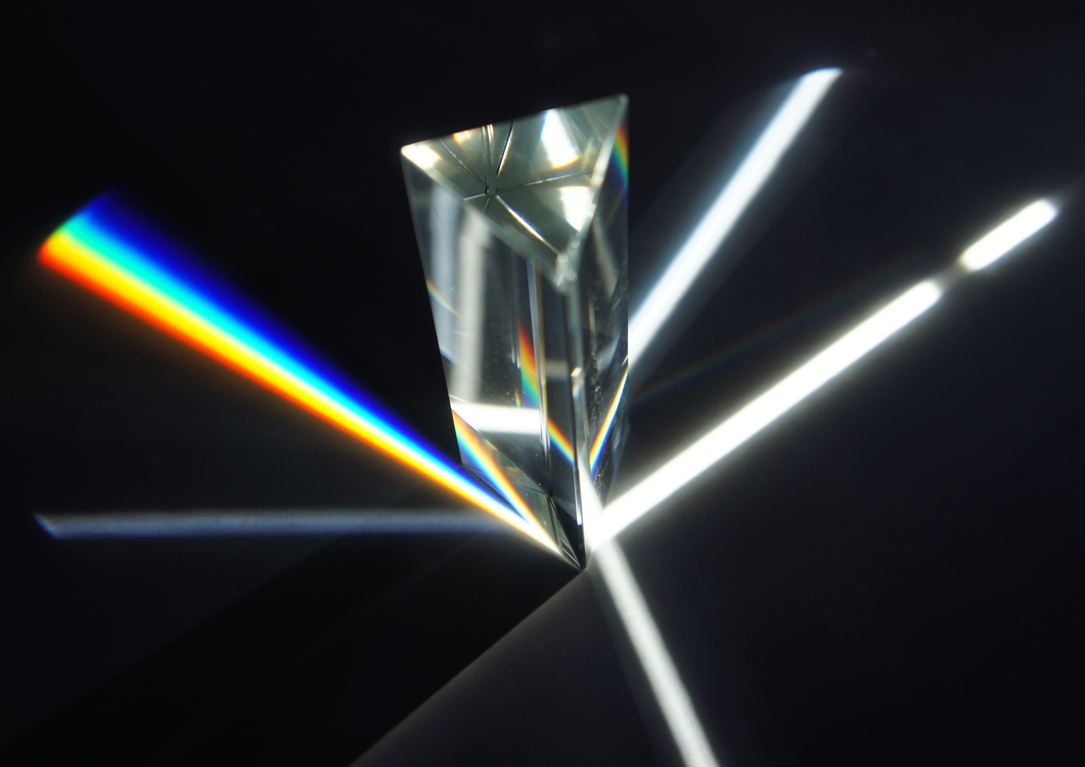
I’ve been thinking about prisms a lot lately, and I think they show that the secret is is to be sparing with brightness. See below: yes, there are very light areas, but each one ray of light is surrounded and supported by several shades of grey. The light is a function of the overall relationship between all of the colors and values.
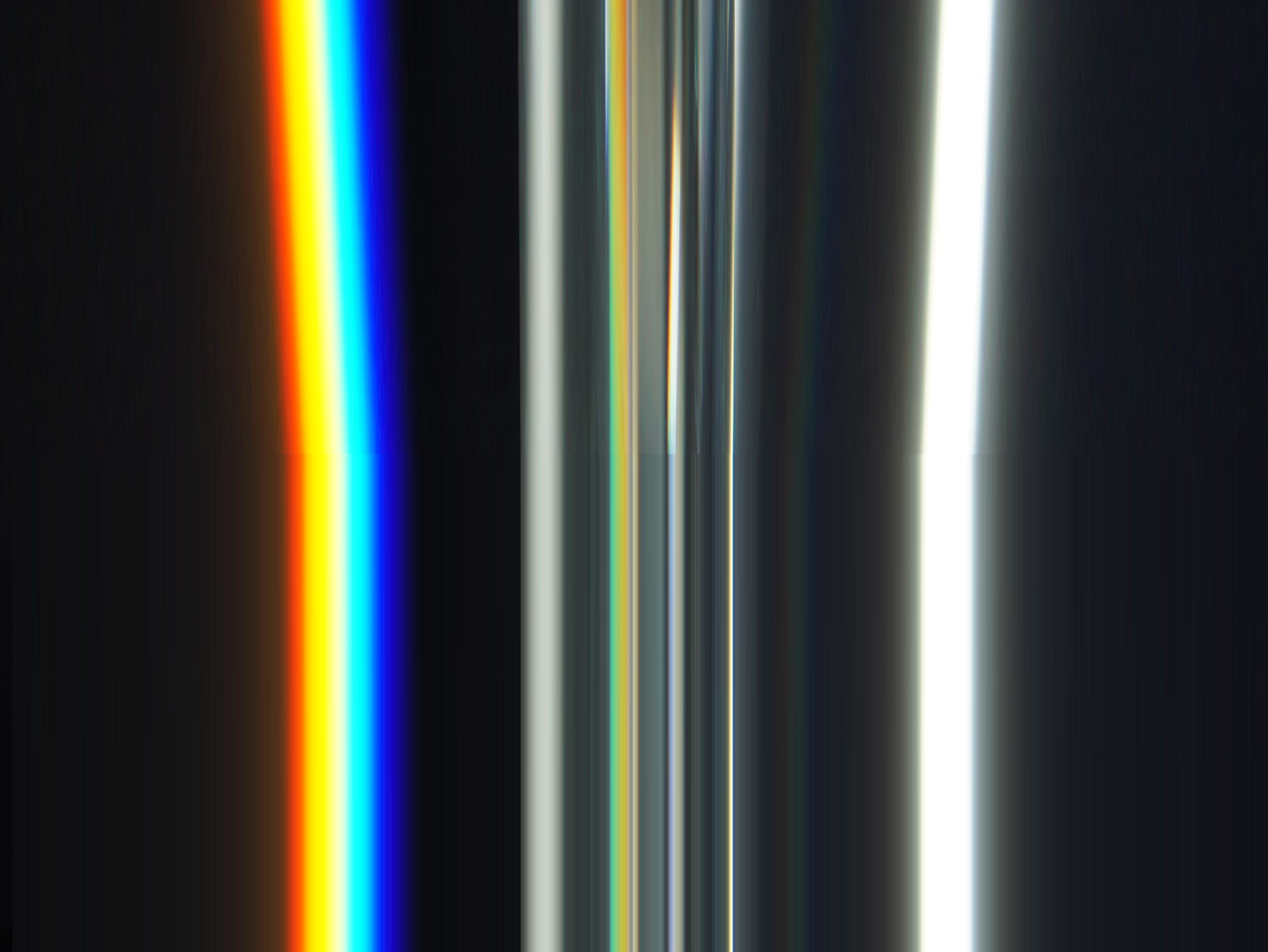
I stretched it out to see how much grey was mixed in (this is a sample from the horizontal centerline of the image):
Fascinations with prisms obviously bring up Pink Floyd, but I also see a lot of hip-hop artists and heavy metal bands using prism colors and effects. Think Shabazz Palaces, P.J. Harvey, or Crystal Castles. It immediately communicates a type of sound and mental space: deeper, meaning-laden, perhaps mysterious, related to the subconscious; and if I can get really synesthetic, these colors are scented with heavier, older, spiritual smells. It accompanies music that sounds like light in darkness, or as a presence in a melancholic space.
Recent Comments